

Architecture photography prints for modern homes: Best 2026
Best overall: Whisper of Curves: A Minimal Study in Architectural Light. Best for a structured home office: Ascending Parallels. Best for mixing modern furniture with classical architecture: Whispers of Marble. These architecture photography prints for modern homes make the 2026 shortlist because each gives you a distinct decorating direction, rather than another interchangeable city view.
- Barksdalefineart architecture photography prints for modern homes suit buyers choosing between minimal light, urban geometry, classical columns, and weathered structures.
- Whisper of Curves is the best overall choice for a restrained modern room.
- Ascending Parallels is the strongest choice for geometric urban wall art in a home office.
- Whispers of Marble connects contemporary furniture with classical architectural subjects.
- Geometry of Forgetting suits modern rooms that need weathered texture rather than polished geometry.
Why this matters
Architecture photography lets you decorate with the same elements that shape a room: lines, curves, repetition, light, and shadow. The useful question is not whether a building is beautiful. It is whether the photograph adds something your room lacks.
A room full of straight-edged furniture has a different need from a room with curved seating and patterned textiles. Choose a print that provides a deliberate contrast or repeats an existing shape without making the entire wall feel repetitive.
Barksdalefineart is best for buyers who want architecture photography prints organized around a clear visual subject. This 2026 guide ranks the architectural directions named in the catalog by their decorating use, not by unverified claims about paper, framing, or production quality.
What makes the best architecture photography prints?
Use these criteria before choosing a subject. A photograph that works in isolation still needs to work beside your furniture, lighting, and other artwork.
- Visual simplicity: Decide whether you want a minimal study or a more detailed architectural subject. Match that choice to the amount of visual activity already in the room.
- Line direction: Curves, parallel lines, and columns suggest different compositions. Choose the direction that supports the wall rather than automatically repeating every nearby edge.
- Tonal fit: Evaluate the actual image beside your upholstery and wall color. A monochrome subject is a different decorating decision from one selected primarily for color.
- Subject character: Minimal architecture, urban geometry, classical columns, and weathered boards each establish a different mood. Pick the character you want before choosing the location.
- Placement fit: Assess the complete framed footprint, viewing distance, and surrounding objects. Do not select a size from the product image alone.
For your 2026 shortlist, choose the subject first and confirm the physical format second. That keeps a compelling photograph from becoming an awkward installation.
Architecture photography prints at a glance
The order below matches the detailed recommendations. The limitations are decorating trade-offs, not claims about manufacturing quality.
| Best for | Standout subject | Key limitation | |
|---|---|---|---|
| Whisper of Curves | Restrained modern living rooms | Minimal architectural light and curves | Not the direction to choose for a detailed city narrative |
| Ascending Parallels: A Monochrome Study in Urban Geometry | Structured home offices | Monochrome urban geometry | Adds more geometric emphasis to an already linear room |
| Whispers of Marble: Depth and Contrast in Classical Columns | Modern rooms with classical references | Columns, depth, and contrast | Classical subject matter is not the purest contemporary direction |
| Geometry of Forgetting: Weathered Boards and Shadows Over the Tide | Modern rooms needing weathered texture | Boards, shadows, and a tidal setting | Weathered subject matter conflicts with a deliberately polished brief |
1. Whisper of Curves: best for restrained modern living rooms
Whisper of Curves centers its architectural subject on curves and light. The catalog title identifies it as a minimal study, making it the clearest starting point when you want architecture without a skyline-led decorating scheme.
Choose this direction when your room already has a strong furniture arrangement and the artwork should support it. You are selecting a study of form, not asking the wall to tell a detailed story about a city.
Whisper of Curves pros:
- Offers a minimal architectural direction for a restrained room.
- Introduces curves as an alternative to repeated straight lines.
- Makes architectural light the subject rather than relying on a named landmark.
Whisper of Curves cons:
- A minimal study is the wrong brief if you want abundant architectural detail.
- It does not offer the explicit place identity of a named cityscape.
Best for: A modern living room where the artwork should complement the furniture rather than establish a travel theme.
Before committing, compare the actual image with the most dominant shape in your room. If your sofa, rug, and coffee table already repeat curves, decide whether another curved element feels intentional or simply redundant.
Verdict: Buy Whisper of Curves for a restrained architectural focal point; skip it when recognizable place is your priority.
2. Ascending Parallels: best for structured home offices
Ascending Parallels is described in its catalog title as a monochrome study in urban geometry. It belongs on your shortlist when you want the wall to emphasize architectural order rather than landscape, ornament, or color.
A home office gives this direction a clear role: it can connect the artwork to the lines of a desk, shelving, or cabinetry. The trade-off is repetition. A room already dominated by grids needs a deliberate decision about whether to reinforce them.
Ascending Parallels pros:
- Gives you an explicitly monochrome architectural option.
- Centers urban geometry rather than a broader scenic setting.
- Provides a clear decorating direction for a linear office arrangement.
Ascending Parallels cons:
- Monochrome imagery will not provide a color-led accent.
- More geometry is not the right answer when your room needs softer forms.
Best for: A home office whose decor brief is urban, geometric, and restrained.
Compare Ascending Parallels with your shelving before deciding. If the shelves are packed with objects and strongly divided compartments, keep the rest of the wall simple rather than adding several competing architectural studies.
Verdict: Buy Ascending Parallels for geometric office wall art; skip it if your main goal is to soften the room.
3. Whispers of Marble: best for modern-classical interiors
Whispers of Marble names classical columns, depth, and contrast as its subject. It is the strongest choice here when you want contemporary furniture to sit alongside an older architectural vocabulary.
The appeal is the contrast between the subject and the room. You do not need to turn a modern home into a classical interior to choose a photograph of columns; the architectural reference can remain confined to the artwork.
Whispers of Marble pros:
- Introduces classical architecture without requiring a themed room.
- Offers columns as an alternative to urban parallel lines or minimal curves.
- Gives you a subject-led choice when historical architectural character matters.
Whispers of Marble cons:
- Classical columns are the wrong subject for a strictly contemporary architecture brief.
- Additional ornamental decor can make the room's references feel repetitive.
Best for: A modern dining room or living room where you want a deliberate classical counterpoint.
Let the photograph carry that reference. If you choose Whispers of Marble, you do not also need column-shaped accessories or multiple historical architectural images nearby. Evaluate the print against the entire arrangement, not just the furniture immediately below it.
Verdict: Buy Whispers of Marble for a modern-classical contrast; skip it when you want contemporary architecture throughout.
4. Geometry of Forgetting: best for adding weathered texture
Geometry of Forgetting names weathered boards, shadows, and a tidal setting. Its architectural direction is material and atmosphere rather than polished urban geometry.
Choose this subject when a modern room feels too uniform and you want the image to introduce a less pristine reference. It is also the most specific alternative here for buyers drawn to built structures in a coastal context.
Geometry of Forgetting pros:
- Makes weathered material part of the architectural subject.
- Combines structural geometry with shadows and a tidal setting.
- Offers an alternative to columns and urban architectural studies.
Geometry of Forgetting cons:
- Weathered boards are not the right subject for an immaculate, polished brief.
- The tidal reference is unnecessary if you want exclusively urban imagery.
Best for: A modern room that needs weathered architectural character rather than another clean-lined subject.
Keep the distinction clear: a photograph of weathered material adds that visual reference, not actual surface texture to the wall. Assess the image itself before assuming it will provide the color or contrast your room needs.
Verdict: Buy Geometry of Forgetting for weathered architectural character; skip it for a purely polished urban scheme.
Match the architectural subject to your room
Start with the decorating job. A print can reinforce what is already present or introduce a contrast, but choosing both goals at once makes the decision harder.
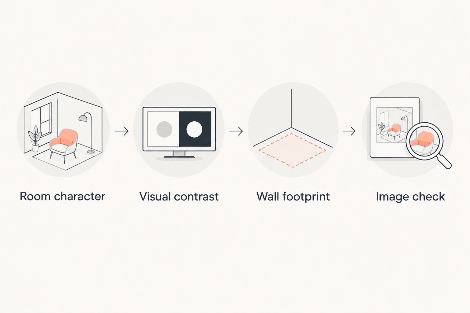
Use this simple sequence to narrow your options:
- Room character: Identify whether the room feels restrained, geometric, classical, or overly polished.
- Visual contrast: Decide what is missing: curves, structure, historical reference, or weathered character.
- Wall footprint: Assess the space the complete framed piece will occupy.
- Image check: Compare the actual artwork with nearby materials and colors before ordering.
For a living room, begin with the view you see most often from the seating. For a home office, consider both your seated view and the wall visible behind you during video calls. A print should work in the room itself, not only in a cropped photograph of it.
Avoid choosing an architectural photograph solely because its subject resembles your furniture. A room with straight shelving does not automatically need more straight lines. Whisper of Curves offers the contrasting direction; Ascending Parallels offers the reinforcing one.
Check placement before choosing the format
Use a removable paper template to represent the complete framed footprint on the wall. Stand at your normal viewing position and check its relationship to the furniture, outlets, switches, and adjacent artwork.
Move the template before changing the subject. An appealing architectural image can look disconnected when its placement ignores the furniture below it. This check is about your room, not a claim that any particular print has a prescribed installation size.
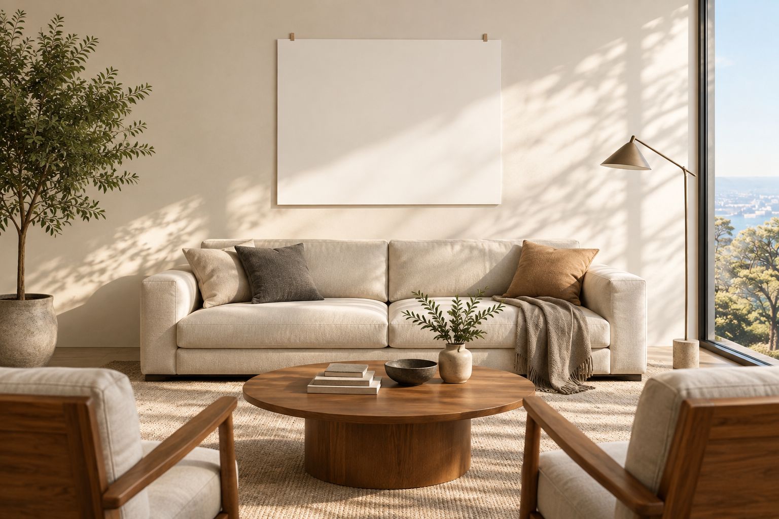
Then check the product's stated dimensions, medium, and framing information. Product titles identify subjects; they do not establish every physical specification. Confirm the details that affect installation before treating your room plan as finished.
How the prints were ranked
This 2026 ranking prioritizes visual simplicity, line direction, tonal fit, subject character, and placement fit. It is a room-matching guide, not a claim of laboratory testing or a comparison of unspecified print materials.
Barksdalefineart's architecture photography prints cover distinct subjects in this shortlist. Whisper of Curves takes the default position because its minimal architectural direction matches a restrained modern brief; the other recommendations win when you need geometry, classical references, or weathered material instead.
Which architecture photography print should you choose?
Choose Whisper of Curves if you want the clearest default for a restrained modern home in 2026. Choose Ascending Parallels when geometric urban imagery is the point, not a compromise.
Choose Whispers of Marble for a classical counterpoint to contemporary furniture. Choose Geometry of Forgetting when the room needs weathered architectural character. These are different decorating jobs; the lower-ranked print can be the better choice for your particular wall.
FAQ
What's the best architecture photography print for a modern living room?
Whisper of Curves is the best default here for a restrained modern living room. Its catalog title identifies a minimal study in architectural light, making it a subject-led alternative to a cityscape.
Which architectural print should I choose for a home office?
Ascending Parallels is the strongest choice here for a geometric home office. Its monochrome urban subject suits a brief centered on architectural order; choose another direction if you want to soften an already linear room.
Is monochrome architecture photography better than color for modern homes?
Neither is automatically better; choose according to the decorating job. Monochrome is the direct choice when you want to emphasize geometry without selecting the artwork primarily for color.
Can classical architecture photography work with modern furniture?
Yes, classical architecture photography can provide a deliberate contrast with modern furniture. Whispers of Marble offers classical columns as the subject, so the architectural reference can remain in the artwork rather than extending throughout the room.
Which print works best in a modern room that feels too polished?
Geometry of Forgetting is the shortlist choice for adding weathered architectural character. Its catalog title names weathered boards, shadows, and a tidal setting rather than polished urban geometry.
How do I choose the right size for an architectural photograph?
Choose the size by checking the complete framed footprint on your wall. Use a removable paper template, assess it from your normal viewing position, and confirm the product's stated dimensions before ordering.
Should architecture photography match every line in my furniture?
No, architecture photography does not need to repeat every furniture line. Choose repetition when you want a coordinated geometric scheme and contrast when the room needs a different shape or subject.
One last thing
Do not make the building's identity do all the work. Before choosing, look at the actual photograph and ask whether you still want its lines, light, and composition when the location is not the deciding factor.
For Barksdalefineart buyers, that separates an architectural decorating choice from a place-based keepsake. Both have a role. Choose the one you want this wall to serve.


