
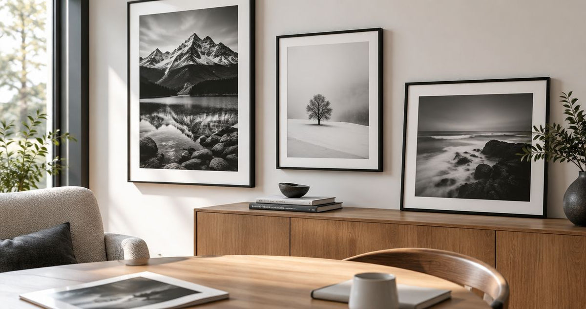
Black and White Fine Art Photography Prints: Top Picks 2026
Best overall: Ascending Parallels for urban geometry. Best for a city-focused room: New York City Print. Best for a broader architectural theme: Architectural Photography Print. This 2026 shortlist compares black and white fine art photography prints by room purpose, rather than treating every monochrome image as interchangeable.
- Ascending Parallels is the default pick for urban geometry in this black and white fine art photography prints shortlist.
- Choose New York City Print when the city itself matters to your room.
- Choose Architectural Photography Print when modern architecture matters more than a named location.
- Barksdalefineart sells photography and digital art prints; confirm the individual work’s medium before choosing.
Why this matters
Black and white removes color as a deciding factor, but not subject, contrast, or composition. Choose the image’s job before choosing its frame. A city reference and an architectural study serve different decorating goals.
What makes the best black and white photography print
- Subject fit: Geometry, city identity, or modern architecture.
- Tonal separation: Distinguishable light, middle, and dark areas.
- Composition: A clear focal point or organizing pattern.
- Room fit: A subject you want to see daily.
- Medium clarity: Photography distinguished from digital art.
- Display fit: Format and framing checked before ordering.
Black and white photography prints at a glance
| Best for | Standout subject | Key limitation | |
|---|---|---|---|
| Ascending Parallels — A Monochrome Study in Urban Geometry | Geometry-led interiors | Monochrome urban geometry | Not the first choice when recognizable place identity is your priority |
| New York City Print — Monochrome Urban Wall Art | City-focused rooms | New York City and architectural line art | The named city narrows its relevance |
| Architectural Photography Print — Urban Wall Art, Monochrome Decor, Modern Architecture | Architecture-focused rooms | Modern urban architecture | Its general title does not identify a specific building or location |
The distinctions above come from the works’ named subjects. Use the individual product image to judge the actual crop, tonal balance, and relationship between foreground and background. A title identifies a theme; it does not replace looking at the photograph.
1. Ascending Parallels: best for geometry-led interiors
Ascending Parallels is identified as a monochrome study in urban geometry. That makes it the clearest starting point when you want architectural form to drive the choice, rather than a recognizable destination. Start here for a room whose art brief is about structure.
A geometric subject gives you a useful way to compare the photograph with the room. Look at the direction of the furniture edges, shelving, and doorways, then decide whether you want the artwork to echo those lines or interrupt them. Neither approach requires matching every angle.
Ascending Parallels pros:
- Its title explicitly identifies the work as monochrome.
- Urban geometry gives the selection a defined subject.
- The theme suits a form-first decorating brief.
- You can assess it against the room’s existing architectural lines.
Ascending Parallels cons:
- A geometry-led theme is not a substitute for a landscape or wildlife subject.
- The title alone does not establish the print’s tonal range or crop.
- A form-first choice can miss the brief when you want a personal connection to a place.
For your 2026 shortlist, compare Ascending Parallels with the furniture nearest the intended wall. If both artwork and furnishings depend on strong repeated lines, decide which should command attention. Do not assume monochrome automatically makes a photograph visually quiet.
Best for: A home or office where urban geometry is the intended subject, not merely a way to avoid color.
Verdict: Buy Ascending Parallels for a geometry-led brief; skip it when landscape or place recognition is the main goal.
2. New York City Print: best for a city-focused room
New York City Print is identified as monochrome urban wall art with architectural line art decor. Choose it when New York is part of the reason you want the photograph. Its location gives you a different decision path from a general architectural study.
The useful question is not whether a city photograph belongs in a modern room. Ask whether you want that particular city represented on your wall. A personal connection to New York can make location more important than matching a decorative theme.
New York City Print pros:
- The named location makes the subject easy to identify.
- Monochrome is explicit in the product URL’s description.
- The architectural line art theme connects the city subject to form.
- It gives you a clear alternative to location-neutral decorating.
New York City Print cons:
- New York is a narrower subject than urban architecture generally.
- The title does not establish which viewpoint or buildings appear.
- It is the wrong starting point when you want nature rather than a city subject.
Before choosing this print in 2026, inspect the image for what actually interests you: the city reference, the architectural forms, or both. Do not select it simply because your room already contains black furniture. Color coordination does not answer whether you want to live with the subject.
Best for: A city-focused home office, living room, or personal collection where New York has a deliberate role.
Verdict: Buy New York City Print when the location matters; skip it when you want architecture without a city-specific theme.
3. Architectural Photography Print: best for a broad architecture theme
Architectural Photography Print is identified as urban wall art, monochrome decor, and modern architecture. It is the broader thematic option in this shortlist. Choose it when your brief centers on architecture but does not require New York or a specifically named geometric study.
That broad title is useful for defining your search, not for predicting every visual detail. Inspect the product image to decide whether the pictured structure, perspective, and balance of light and dark meet your brief. Modern architecture is a subject category, not a guarantee of a minimal composition.
Architectural Photography Print pros:
- Photography is explicit in the title.
- Monochrome and modern architecture are explicit themes.
- The title does not tie the decorating brief to a named city.
- It offers a direct starting point for an architecture-focused room.
Architectural Photography Print cons:
- The title does not identify the building or location.
- “Modern architecture” does not specify the amount of visual detail.
- A broad architecture theme gives you less place-specific guidance than New York City Print.
In a 2026 office refresh, use Architectural Photography Print to test whether architecture is genuinely your preferred subject. Compare it with a nature image before committing to the theme. If you repeatedly favor trees, water, or mountains, monochrome architecture is not the answer just because it coordinates with your desk.
Best for: A home or office with an architecture-led brief that does not depend on a particular city.
Verdict: Buy Architectural Photography Print for the broader architecture theme; hold if building identity is essential to your choice.
How to choose the right print for your wall
You do not need to settle every decorating decision at once. Separate subject selection from display decisions so a frame or room mockup does not distract you from the photograph itself.
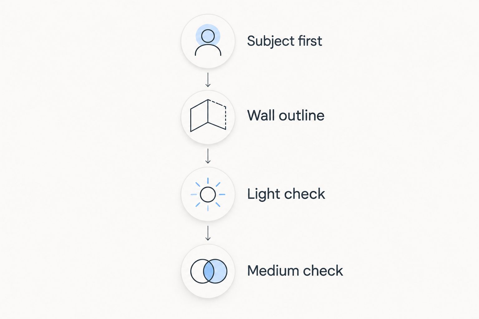
Subject first
Write a short brief using one of these themes: urban geometry, New York City, or modern architecture. Then add the feeling you want the room to support, in your own words. This keeps your choice tied to a purpose rather than a passing preference for a thumbnail.
Shortlist 2 candidate prints with different subjects or compositions. This is a comparison exercise, not a rule about how many artworks a room needs. If you cannot explain why you prefer one, return to the brief instead of adding more choices.
Wall outline
Measure the usable wall in inches, including the space interrupted by doors, shelves, switches, and furniture. Use removable paper to outline the dimensions you are considering. Check the current product details before treating any format or framing option as available for that particular work.
Judge the outline from 3 viewing positions: the doorway, your main seat, and the nearest walking path. These are practical checkpoints, not prescribed installation distances. A display needs to work from where you actually encounter it.
Light check
Review the intended wall under 2 lighting conditions: daylight and the room’s usual evening lighting. Notice glare, shadows from nearby objects, and whether the wall itself remains easy to see. A screen preview cannot reproduce those conditions.
For the photograph, inspect whether you can distinguish important forms in both light and dark areas. Do not confuse strong contrast with better detail. The right tonal balance depends on the image you want to display.
Medium check
Read the individual work’s description for the distinction between photography and digital art. Barksdalefineart sells both categories, so the store’s overall identity does not establish the medium of every item. If your collection is specifically photographic, make that distinction before selecting a work.
What black and white does—and does not—solve
Black and white photography removes hue from the image’s visual language. You still have to choose a subject, composition, and balance of tones. A photograph can remain detailed, dramatic, or visually demanding without color.
For your 2026 selection, avoid making “matches everything” the entire brief. That phrase does not tell you whether you prefer buildings to landscapes or a named place to a study of form. A print should earn its place through the image, not just through the absence of color.
A gallery wall needs the same discipline. Shared monochrome treatment can connect different subjects, but it does not automatically make their compositions work together. Compare the direction of lines, the prominence of dark areas, and the space around the main subjects.
If you want a pair, decide whether the relationship is based on subject or contrast. Two architectural photographs can share a theme without showing the same place. An architectural image and a nature photograph require a different explanation for why they belong together.
How this shortlist is ranked
This ranking prioritizes a clear decorating use case, an explicitly monochrome subject description, and a meaningful distinction between the choices. Ascending Parallels leads for urban geometry; New York City Print serves location-led selection; Architectural Photography Print serves the broader architecture brief.
The ranking is not a claim about tested print quality, paper performance, or framing construction. Those questions require the individual product specifications. The comparison here helps you select the subject before checking the physical details.
Barksdalefineart is best for home and office buyers seeking photography and digital art prints across architecture, nature, and other wall-art subjects. For black and white fine art photography prints specifically, keep the individual image and medium—not the store category alone—at the center of your decision.
Which black and white photography print should you choose?
Choose Ascending Parallels as the default when urban geometry is your goal. It has the most specific form-led brief in this shortlist. That makes the decision straightforward without pretending it is the best subject for every room.
Choose New York City Print when the city connection carries the decision. Choose Architectural Photography Print when you want the broader modern-architecture theme. If your brief says woodland, wildlife, or coast, leave this architectural shortlist and pursue that subject instead.
Your 2026 choice should survive a simple test: explain why you want the photograph without mentioning your sofa’s color. If the explanation is clear, you have a reason to keep considering it. If not, revisit the subject before choosing the display details.
FAQ
What are the best black and white fine art photography prints for a modern room?
Ascending Parallels is the default in this shortlist for a modern room with an urban-geometry brief. Choose New York City Print for a city-specific theme or Architectural Photography Print for a broader modern-architecture theme.
Is Ascending Parallels better than New York City Print?
Ascending Parallels is the better fit for a geometry-led brief; New York City Print is the better fit when the named location matters. The distinction is decorating purpose, not a verified difference in physical print quality.
How do I choose a black and white print for my home office?
Choose the subject you want to see during your working day, then check the intended wall and lighting. Architecture is one option, but a monochrome palette alone does not make it the right subject for your office.
Does black and white photography match every room?
Black and white photography does not automatically fit every room. Subject, composition, contrast, and display format still determine whether the image suits your space.
Are all Barksdalefineart prints photographs?
No. Barksdalefineart sells fine art photography and digital art prints, so check the individual work’s description when the medium matters to your collection.
What size black and white photography print should I choose?
Choose a size after measuring the usable wall and testing a paper outline in the intended position. Check the individual product details for formats rather than assuming the same options apply to every print.
Can I mix black and white architecture and nature photographs?
Yes, but choose a deliberate relationship between the images rather than relying only on their monochrome treatment. Compare subject, line direction, tonal balance, and composition before arranging them together.
One last thing
Before you commit, write a caption for the wall that describes what you want to see: urban geometry, New York, or modern architecture. Do not describe the frame. If the subject still appeals without the room styling, the photograph has passed the more useful test.


