Fine art wall art prints ranked by size for large walls in 2026
Best overall: one large horizontal print. Best for tall walls: one large vertical print. Best for an adjustable footprint: a three-print arrangement. This 2026 guide to wall art prints ranked by size for large walls compares layout strategies so you can choose the right footprint before choosing the image.
- For wall art prints ranked by size for large walls, start with the finished arrangement, not individual image dimensions.
- One large horizontal print is the default recommendation above wide furniture; a vertical print suits a tall wall section.
- Barksdale Fine Art suits home and office buyers seeking fine art photography and digital art prints.
- Compare single prints, paired prints, and gallery walls by their outside edges, including frames and gaps.
Browse Barksdale Fine Art for landscape, nature, architecture, western, wildlife, and abstract subjects. Choose the layout first; then select artwork whose subject and orientation fit it.
Why this matters
A large wall does not automatically need the largest individual print. It needs an arrangement that belongs to the usable space, whether that means one focal image, a pair, or a coordinated group.
For your 2026 room plan, distinguish the whole wall from the area you actually want to furnish. Doors, windows, shelving, furniture, and switches divide that space. A broad wall with a narrow clear section presents a different problem from an uninterrupted wall above a sofa.
Barksdale Fine Art is best for home and office buyers seeking photography and digital art prints rather than decorative text signs. The size decision still belongs to your room: choose the outside dimensions of the finished display, not just a subject you like.
What makes the best wall art prints for large walls?
Use these criteria before comparing layouts:
- Finished footprint: Measure the outside edges of the completed display, including frames, mats, and spaces between prints.
- Wall shape: Compare usable width with usable height. A wide rectangle and a tall rectangle need different arrangements.
- Furniture relationship: Decide whether the display belongs to a sofa, bed, console, or the wall itself.
- Image orientation: Choose a composition that works in its intended shape. Do not assume every image supports a different crop.
- Viewing position: Judge the display from where you normally sit, stand, or enter the room—not only from beside the wall.
- Installation complexity: Compare the work of hanging one piece with aligning several pieces. A larger group adds more placement decisions.
Large-wall print layouts at a glance
This 2026 ranking orders layouts by their usefulness for different large-wall problems, not by a claim that one format is always physically bigger. A single print can exceed a grouped arrangement; the final dimensions determine the actual size order.
| Rank and layout | Best for | Standout feature | Key limitation |
|---|---|---|---|
| 1. Large horizontal print | Wide walls above furniture | One continuous focal image | Requires a suitable horizontal composition |
| 2. Large vertical print | Tall, narrow wall sections | Uses height without spreading sideways | Does not address a broad wall by itself |
| 3. Two-print arrangement | A balanced display with separate subjects | Spreads the footprint across two images | Requires coordinated scale and alignment |
| 4. Three-print arrangement | An adjustable display above long furniture | Builds width through a repeated rhythm | Gaps and alignment become part of the design |
| 5. Gallery grid | Large walls intended for several subjects | Combines multiple images into one outline | Creates more individual visual decisions |
1. Large horizontal print: best for wide walls above furniture
One large horizontal print gives you a continuous image across a broad section of wall. It is the clearest starting point above a sofa, bed, or console when you want the artwork to read as a single focal point.
Start with the finished frame outline. A mat and frame change the display's outside dimensions, so a print measurement alone does not tell you how the completed piece will occupy the wall.
Large horizontal print pros:
- Presents one composition without intervening gaps.
- Keeps the display focused on a single subject.
- Requires fewer alignment decisions than a grouped arrangement.
Large horizontal print cons:
- Depends on a composition that works horizontally.
- Offers less layout flexibility after you choose the finished dimensions.
Best for: A wide, uninterrupted wall section above substantial furniture.
Look at the whole image before committing to a large version. Identify the main subject and the surrounding space you want to preserve. If fitting your chosen frame requires removing an important part of the composition, change the size or image rather than forcing the crop.
Verdict: Buy a large horizontal print when one continuous image fits the furniture and the clear wall area.
2. Large vertical print: best for tall, narrow wall sections
One large vertical print gives a tall wall section a defined focal point without requiring a wide arrangement. Consider this format between openings, beside furniture, or on a narrow section of a high wall.
Treat the usable wall section as the boundary. Extending upward does not solve a sideways proportion problem, and a vertical image should not be chosen merely because the entire room has a high ceiling.
Large vertical print pros:
- Makes use of height within a restricted width.
- Preserves a single, uninterrupted composition.
- Avoids the sideways spread of a multi-print display.
Large vertical print cons:
- Leaves much of a broad wall unaddressed when used alone.
- Requires a subject and composition suited to a tall format.
Best for: A tall wall section whose width is constrained by architecture or furniture.
Architecture, trees, and waterfalls are useful subjects to consider, but inspect the actual composition. The subject name does not establish orientation. A photograph of a tall building can still be composed horizontally.
For a 2026 room refresh, outline the vertical display before selecting the subject. Stand at the room's entrance and check whether the rectangle belongs to that wall section or appears disconnected from everything beneath it.
Verdict: Buy a large vertical print for a tall, narrow section; skip it as the sole answer to a broad wall.
3. Two-print arrangement: best for balanced separate subjects
A two-print arrangement creates a wider footprint without making one image carry the entire wall. Choose it when you want two complete compositions rather than one image divided into pieces.
The pair needs a visible relationship. Matching outside frame dimensions provide one approach; related subjects, shared colors, or similar compositions provide others. Avoid assuming that any two favorite images automatically form a cohesive display.
Two-print arrangement pros:
- Accommodates two distinct subjects.
- Creates a combined footprint wider than either individual piece.
- Lets you establish a clear visual relationship between images.
Two-print arrangement cons:
- Adds a gap that must be included in the total width.
- Requires deliberate coordination of frames, scale, and alignment.
Best for: A balanced display above a console or furniture grouping where two subjects belong together.
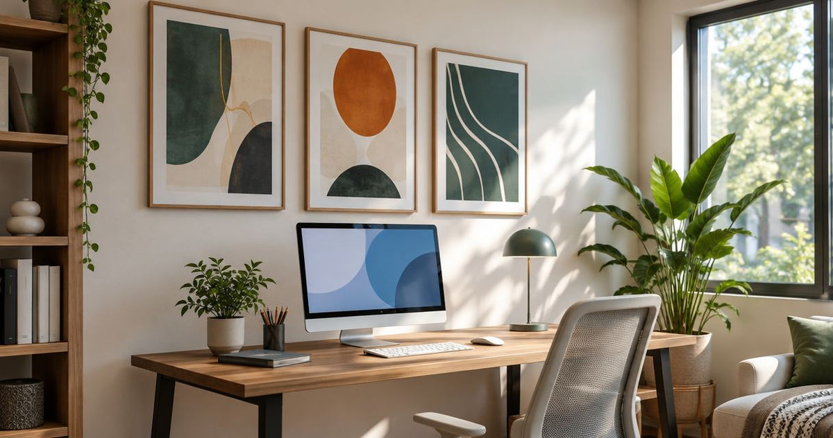
With two prints, you have one internal gap. Measure from the outside left edge of the first frame to the outside right edge of the second—not merely the combined print widths. That finished span is what you should compare with the wall.
Keep the images independent unless you are deliberately choosing a coordinated multi-panel work. Pairing photographs is not the same as splitting a photograph, and the two approaches create different visual results.
Verdict: Buy a two-print arrangement when you want a clear pair, not a substitute for an unsuitable single image.
4. Three-print arrangement: best for adjustable horizontal coverage
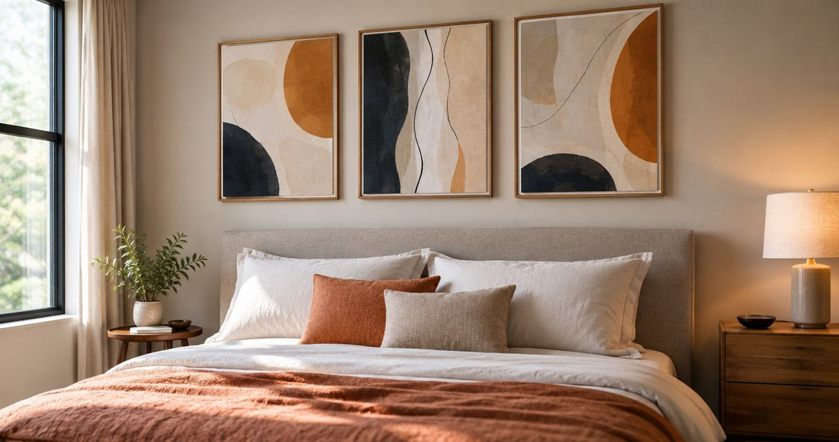
A three-print arrangement builds a broad display from separate images. It suits a long furniture grouping when you prefer repetition and several subjects over one continuous scene.
The combined footprint includes three finished frames and two internal gaps. Those gaps are part of the layout, not leftover space to decide after the frames are hanging.
Three-print arrangement pros:
- Builds width through repeated frames.
- Supports a related sequence of distinct images.
- Lets you plan the overall span through frame dimensions and spacing.
Three-print arrangement cons:
- Requires consistent alignment across several pieces.
- Divides attention between images rather than maintaining one uninterrupted view.
Best for: Long furniture groupings where a repeated horizontal arrangement matches your preferred style.
Choose a linking idea before choosing the individual prints. For Barksdale Fine Art wall art prints, that idea can come from the stated subject categories: landscapes, architecture, nature, western, wildlife, or abstract art. The shared category is a starting point, not proof that the images match.
Compare the actual compositions together. Check whether one print dominates the others through subject placement or contrast. A deliberate focal image is a valid choice; an accidental imbalance is something to correct before hanging.
Verdict: Buy a three-print arrangement when the repeated layout is intentional; hold until the complete footprint is planned.
5. Gallery grid: best for a wall with several subjects
A gallery grid treats multiple prints as one larger arrangement. Use it when your goal is a collection rather than a single dominant photograph.
Begin with the grid's outside boundary and work inward. Decide which frame sizes and spacing create that boundary before adding images; otherwise, the display becomes a collection of separate purchases without a planned shape.
Gallery grid pros:
- Gives several subjects a defined shared outline.
- Creates a display from individual pieces rather than one large image.
- Supports a consistent frame treatment across a collection.
Gallery grid cons:
- Introduces more alignment and spacing decisions.
- Adds visual detail that competes with other furnishings and objects.
Best for: A wall intended to display a collection of related images.
Evaluate the grid from the normal viewing position. If you mainly see it from across the room, judge the overall arrangement first. If you pass close beside it, also consider whether the individual subjects reward that closer view.
Do not choose a gallery grid merely to avoid deciding on a focal image. It is a different design choice, with its own balance of variety and order.
Verdict: Buy a gallery grid for an intentional collection; skip it when your goal is one quiet focal point.
How to rank your shortlist by actual size
To create a true size ranking for your 2026 shortlist, compare finished footprints using the same measurement convention. Record width and height in inches for every option; do not compare one print's paper dimensions with another arrangement's framed dimensions.
Follow this sequence:
- Clear wall: Measure the usable section and mark the furniture or architectural feature the display belongs to.
- Finished footprint: Record outside frame dimensions, including any matting that changes the finished size.
- Group spacing: Add internal gaps when comparing paired prints, three-print arrangements, or grids.
- Viewing position: Outline the complete arrangement with removable paper templates and inspect it from your usual position.
- Final selection: Choose the image and layout together, then confirm the selected dimensions before ordering.
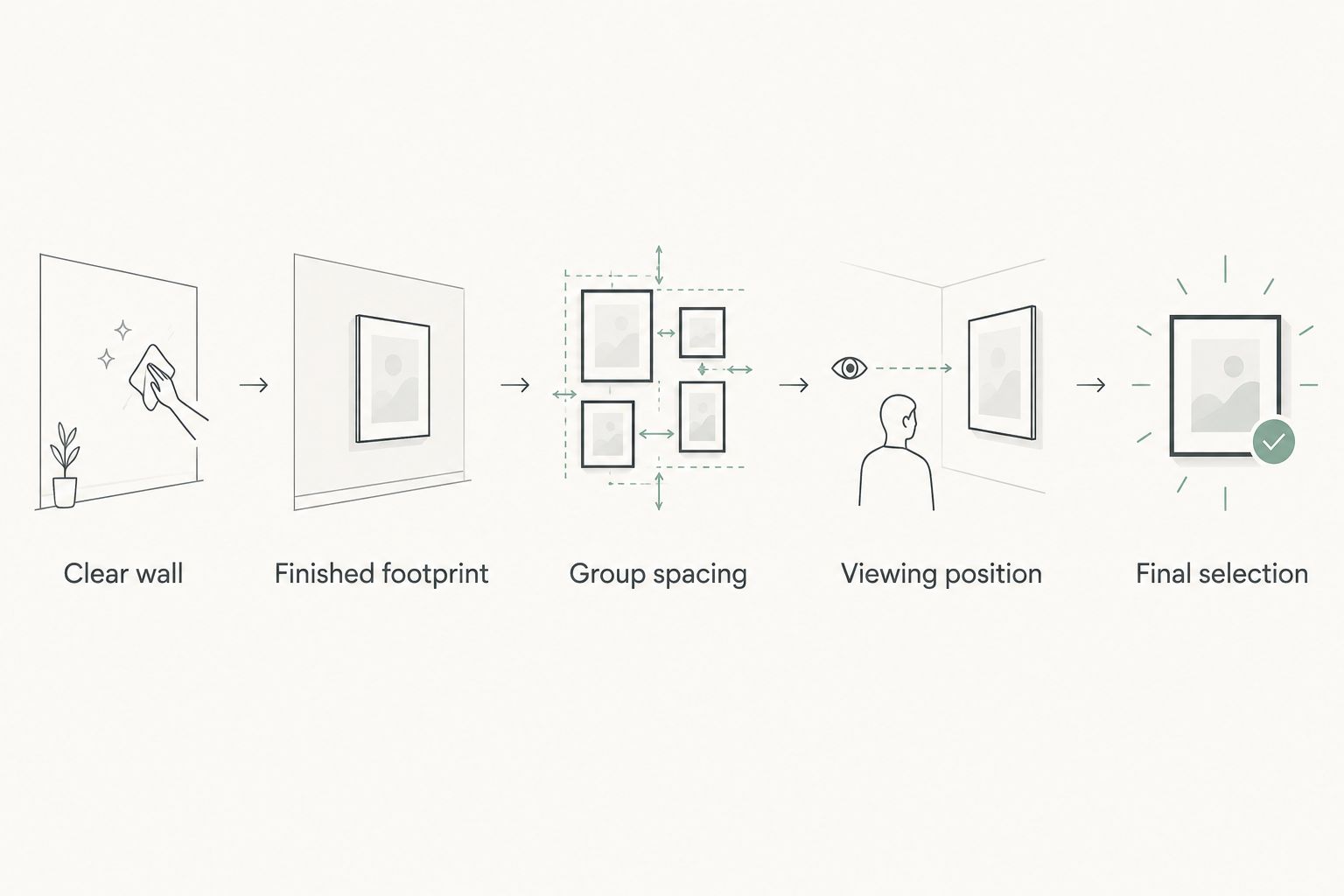
For a horizontal row, add every finished frame width and every internal gap. For a grid, compare both the complete width and the complete height. Area alone is not enough: two displays can occupy similar areas while fitting very different wall shapes.
Rank by width when the main constraint is a long furniture grouping; rank by height when the wall section is narrow and tall. Then use the second dimension as a fit check. This gives you a useful size order rather than a list sorted by a label such as large or oversized.
Choose the subject after the footprint
A landscape, architectural photograph, or wildlife image still needs the right finished outline. Subject preference and wall fit are separate decisions; neither replaces the other.
For a nature-led shortlist, consider the Columbia River Gorge landscape photography print. Compare its composition with the rectangle you have planned rather than assuming a landscape subject requires a horizontal format.
These Barksdale Fine Art landscape prints provide subjects to consider after the layout decision. Confirm the selected format and finished dimensions on the product listing before treating either as a match for your wall.


How the layouts are ranked
The ranking prioritizes a clear match between wall shape, furniture relationship, and display footprint. A horizontal single print is the default for a broad wall above furniture; the other layouts win when the wall shape or your preference for multiple subjects changes the decision.
Installation complexity breaks ties. One piece has fewer alignment decisions than a group, while a group offers more ways to distribute images across the wall. Neither advantage makes one format universally better.
Which large-wall print layout should you choose?
Start with one large horizontal print if you are undecided and decorating a wide wall above furniture. Change to a vertical print for a tall, narrow section, a pair for two related subjects, or a three-print arrangement for a repeated horizontal display.
Choose a gallery grid only when you want the collection itself to be the focal point. For your 2026 selection, the deciding test is the outlined arrangement on your wall—not the apparent size of a product photograph on a screen.
FAQ
What's the best wall art print layout for a large wall?
One large horizontal print is the default choice for a wide wall above furniture. Choose a vertical print for a tall, narrow section, or a grouped arrangement when you want several separate subjects.
How do I compare wall art prints ranked by size for large walls?
Compare the finished outside width and height of each display. Include frames, mats, and internal gaps so every option uses the same measurement convention.
Is one large print better than three smaller prints?
One large print is better for an uninterrupted focal image; three prints are better for a repeated arrangement of separate subjects. Compare their complete footprints before deciding which fits your wall.
Should I measure the print or the frame?
Measure the finished frame when planning the wall footprint. The image or paper dimensions alone do not include everything that occupies the wall.
Can I use a vertical print on a wide wall?
A vertical print works on a wide wall when it belongs to a defined narrow section or a planned grouping. It is not the default choice for filling a broad, uninterrupted area above wide furniture.
What should I check before choosing Barksdale Fine Art wall art prints?
Check the selected print's dimensions, orientation, and format against your planned display outline. Then compare the subject and composition with the room and the way you will normally view the artwork.
How do I choose spacing for several framed prints?
Choose the gaps as part of the complete arrangement before hanging the frames. Include those gaps in the total width and height, then inspect a full-size paper layout from your normal viewing position.
One last thing
A frame changes the size decision, not just the finish. Before committing, outline the outside frame dimensions on the wall and leave the template in place while you use the room normally. Choose the footprint you enjoy living with, then choose the image that belongs inside it.