Modern Abstract Wall Art for Dining Rooms: Best 2026
Best overall: Whisper of Curves: A Minimal Study in Architectural Light. Best for geometric dining rooms: Ascending Parallels. Best for texture-led dining rooms: Geometry of Forgetting. These Barksdale Fine Art selections approach modern abstract wall art for dining rooms through architectural light, urban geometry, and weathered surfaces rather than literal decorative scenes.
- Whisper of Curves is the default choice for modern abstract wall art for dining rooms with restrained furnishings.
- Ascending Parallels suits geometric dining rooms through its monochrome urban study.
- Geometry of Forgetting suits texture-led dining rooms through weathered boards, shadows, and a tidal subject.
- Choose the composition before the frame; check the artwork from seated and standing positions.
Why this matters
Dining-room art shares attention with the table, chairs, lighting, and whatever you place on the tabletop. Choose a composition that gives the room a clear focal point without turning every surface into a competing display. Start with the atmosphere you want during a meal, not an isolated image on a screen.
For this 2026 shortlist, abstraction means emphasizing shape, light, geometry, or texture. Architectural and surface-based subjects belong in that conversation, but they are not the same as nonrepresentational painting. If you want art with no recognizable subject, make that distinction before choosing.
Barksdale Fine Art is a useful starting point for dining-room buyers who want abstraction rooted in architectural and photographic subjects. The selections below occupy different design roles, so the ranking is a decision guide rather than a claim that every room needs the same artwork.
What makes the best modern abstract dining-room art
Use these five criteria before comparing individual works. Each one answers a different question about how the art will function in your room.
- Composition: Decide whether your room needs curves, repeated lines, or surface texture. Choose the visual structure deliberately rather than treating every abstract image as interchangeable.
- Palette: Compare the artwork with permanent finishes such as flooring, upholstery, and the table. A seasonal centerpiece is a weaker starting point because you can change it easily.
- Visual emphasis: Give the artwork a job: soften the room, reinforce its geometry, or introduce a weathered element. Avoid asking one piece to solve conflicting design goals.
- Wall fit: Measure the usable wall area and include the intended frame in your layout. A compelling composition still needs room around doors, furniture, and lighting.
- Viewing conditions: Evaluate the planned placement from the doorway and a dining chair. Check your evening lighting too; the dining room is not experienced only in daylight.
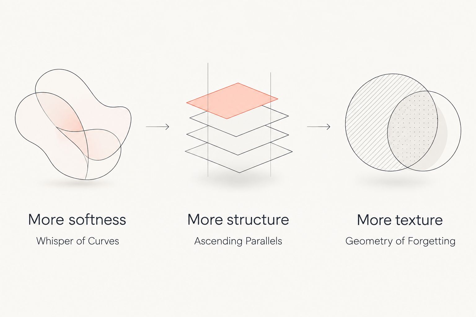
For your 2026 selection, finish this sentence before browsing: This room needs more softness, more structure, or more texture. That answer determines which shortlist entry deserves your attention first. It also gives you a reason to reject an attractive piece that does not suit the space.
Modern abstract dining-room art at a glance
The Barksdale Fine Art shortlist separates three approaches to abstraction. The standout features below come from the named subjects and studies, while the limitations describe the design trade-offs of choosing each approach.
| Ranked selection | Best for | Standout feature | Key limitation |
|---|---|---|---|
| Whisper of Curves | Restrained dining rooms | Minimal architectural-light study centered on curves | Not the first choice for buyers seeking a strong color statement |
| Ascending Parallels: A Monochrome Study in Urban Geometry | Geometric dining rooms | Monochrome treatment of urban geometry | Reinforces structure rather than introducing a softer subject |
| Geometry of Forgetting: Weathered Boards and Shadows Over the Tide | Texture-led dining rooms | Weathered boards and shadows in a tidal setting | Retains a recognizable surface-based subject rather than pure abstraction |
Keep the use-case column in view as you compare. A room that needs softer visual movement calls for a different starting point from a room whose appeal depends on strong lines.
1. Whisper of Curves: best for restrained dining rooms
Whisper of Curves is presented as a minimal study in architectural light. Its emphasis on curves makes it the most direct starting point when you want an architectural subject without making urban geometry the room's main theme.
Best for: dining rooms where you want the wall art to support a restrained interior. Start here when your table, chairs, and pendant already establish a clear design language. Let the artwork contribute another shape rather than another decorative theme.
Whisper of Curves pros
- Its minimal-study framing gives you a clear alternative to scene-heavy imagery.
- Curves provide a distinct direction when you do not want more repeated straight lines.
- Architectural light offers a subject connected to form and space rather than a literal dining motif.
Whisper of Curves cons
- The minimal direction is not the obvious choice for a room that needs an expressive color statement.
- Architectural subject matter is not fully nonrepresentational art; skip it if recognizable structure is the problem you want to avoid.
Before choosing, compare the composition with the outline of your dining furniture. Ask whether it supplies a useful contrast or merely repeats something already prominent. Then check its placement from a dining chair, where your view differs from the standing perspective used while decorating.
For 2026, treat Whisper of Curves as the default, not an automatic answer. Its role is strongest when you want the artwork to participate in the room without changing the whole room's direction.
Verdict: Buy Whisper of Curves for a restrained dining room that needs a curve-led architectural focal point.
2. Ascending Parallels: best for geometric dining rooms
Ascending Parallels is a monochrome study in urban geometry. It gives you the clearest option here when repeated lines and architectural structure are the qualities you want to emphasize.
Best for: dining rooms organized around geometric furniture and a deliberate monochrome direction. Choose Ascending Parallels because you want structure, not simply because black-and-white art feels easy to match. The subject still matters even when color is restrained.
Ascending Parallels pros
- The monochrome approach avoids making an additional accent color the central decision.
- Urban geometry supplies a specific visual theme rather than an undefined abstract label.
- Its structural direction distinguishes it from the curve-led and weathered-surface selections.
Ascending Parallels cons
- Monochrome imagery is not the right answer when introducing color is your main objective.
- Urban geometry reinforces a structural theme; it is a weaker fit when you want a nature-led or visibly softer subject.
Look at the room's existing lines before committing. Chair backs, shelving, window divisions, and pendant supports all contribute geometry. Decide whether you want the artwork to echo that vocabulary or whether the room already has enough of it.
This is also the selection to compare carefully against patterned upholstery. Do not assume that removing color removes visual complexity. Judge the composition alongside the actual chairs, not against a blank background on your screen.
Verdict: Buy Ascending Parallels when monochrome urban geometry is the dining room's intended focal language.
3. Geometry of Forgetting: best for texture-led dining rooms
Geometry of Forgetting names weathered boards, shadows, and a tidal setting as its subject. It offers a surface-based route into abstraction rather than the more explicitly architectural approaches of the first two selections.
Best for: dining rooms where weathered surfaces and a coastal reference belong in the design. Choose Geometry of Forgetting when you want recognizable material to remain part of the image. It is not the same choice as a purely nonrepresentational composition.
Geometry of Forgetting pros
- Weathered boards provide a concrete material subject for a texture-led room.
- Shadows add a light-and-form element to the named composition.
- The tidal reference gives you a coastal direction without choosing a conventional panoramic seascape.
Geometry of Forgetting cons
- The weathered-board subject is not the most direct fit for a room intended to feel strictly urban.
- Recognizable surfaces remain part of the concept, so it does not satisfy a requirement for subject-free abstraction.
Keep the distinction between depicted texture and physical texture clear. An image of weathered boards does not establish that the print itself has a raised or tactile surface. Choose it for the composition and subject, then assess the print format separately.
For your 2026 room plan, consider whether the tidal reference adds something you actually want. If your goal is architectural precision, Ascending Parallels offers the more direct route. If your goal is weathered material, Geometry of Forgetting has the clearer role.
Verdict: Buy Geometry of Forgetting for a texture-led dining room; skip it when pure abstraction is essential.
Choose by the room's missing element
The fastest way to narrow the shortlist is to identify what your room lacks. Do not begin by trying to match every finish. Begin with the visual contribution the artwork needs to make.
- More softness: Start with Whisper of Curves and its curve-led architectural study.
- More structure: Start with Ascending Parallels and its monochrome urban geometry.
- More texture: Start with Geometry of Forgetting and its weathered-board subject.
These are design recommendations, not rules about which furnishings you are allowed to combine. A geometric print can belong beside a rounded table. The useful question is whether that contrast feels intentional when you see the whole room.
Check the wall before choosing the format
Use a short placement exercise before settling on the artwork's format. Measurements should come from your room, not a generic shopping image. Include furniture and lighting in the check rather than treating the wall as an empty rectangle.
- Measure the wall: Record the usable width and height around the intended placement. Mark interruptions such as switches, doors, shelving, and the top of a sideboard.
- Test the outline: Make 3 paper templates representing formats you are considering. Use dimensions you have actually confirmed, including the frame where relevant.
- Check the view: Compare each template from 2 viewing positions: the doorway and a dining chair. Assess the artwork against the furniture visible from each position.
- Simplify the display: Plan for 1 focal point on the chosen wall. Move nearby decorative objects temporarily so you can judge the artwork's role without distraction.
A template tests placement, not image quality. After choosing the outline, return to the composition and ask whether its important shapes remain readable from your usual seat. Keep those decisions separate so a convenient size does not become the only reason you choose a work.
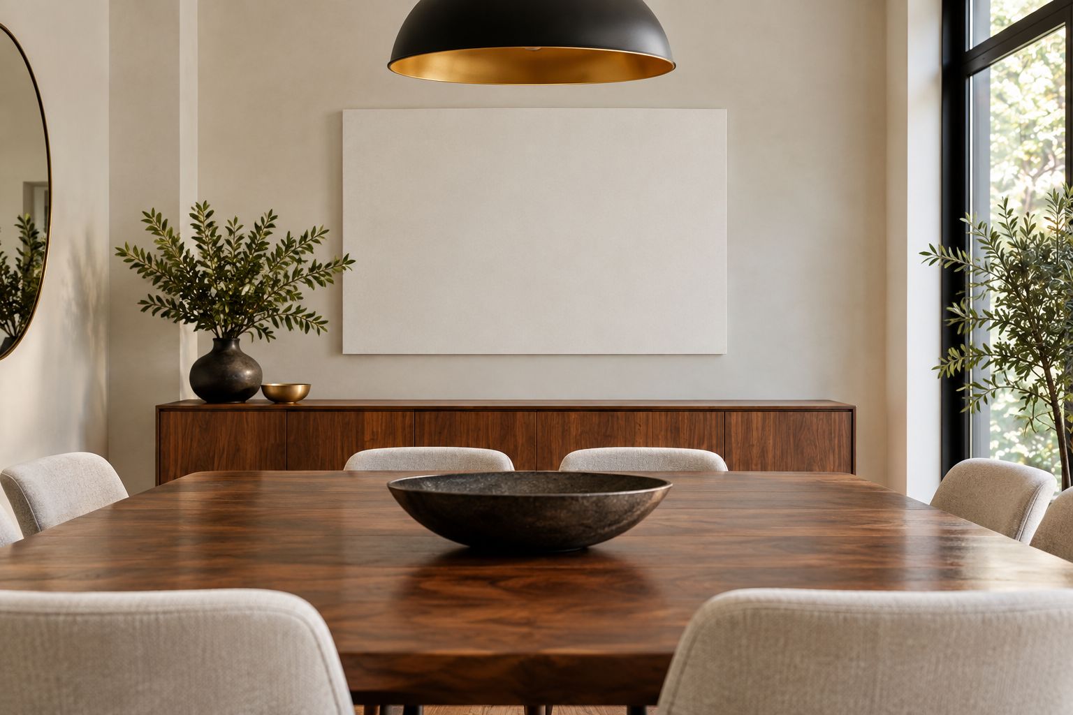
Repeat the visual check with the lighting you use during dinner. Look for distracting reflections and furniture that interrupts the view. Adjust the planned placement before choosing a frame or arranging objects beneath the artwork.
How the shortlist is ranked
This 2026 ranking prioritizes the stated composition and its dining-room use case: curves for restraint, urban geometry for structure, and weathered surfaces for texture. It is a design-fit ranking, not a material-performance comparison.
Whisper of Curves takes the default slot because its minimal architectural-light direction answers the restrained-room brief directly. Ascending Parallels and Geometry of Forgetting lead their separate use cases. Choose the entry that solves your room's specific problem rather than following the order mechanically.
Which modern abstract dining-room art should you choose?
Choose Whisper of Curves if you are undecided and want a restrained architectural direction. Choose Ascending Parallels when monochrome geometry is the point of the room. Choose Geometry of Forgetting when weathered surfaces and a tidal reference belong in the design.
Barksdale Fine Art's modern abstract wall art for dining rooms should be selected by composition first and placement second. Keep both decisions explicit: the right subject on the wrong wall is still the wrong result.
FAQ
What's the best modern abstract wall art for a restrained dining room?
Whisper of Curves is the default choice in this shortlist for a restrained dining room. Its minimal architectural-light study gives you a curve-led alternative to urban geometry or weathered surfaces.
Is architectural photography the same as abstract art?
Architectural photography can emphasize abstract qualities without becoming fully nonrepresentational art. Look for the distinction between an image organized around form and an image with no recognizable subject.
Which selection works best for a monochrome dining room?
Ascending Parallels is the most direct choice for a monochrome dining room in this shortlist. Its stated focus is urban geometry, so choose it when structure is part of your design goal.
What should I choose for a texture-led dining room?
Geometry of Forgetting is the texture-led choice in this shortlist. Its named subject includes weathered boards and shadows over the tide; that describes depicted material, not a guarantee of physical print texture.
How do I choose the right wall-art size for my dining room?
Measure your usable wall area and test confirmed dimensions with paper templates. Include the frame in the outline and compare the placement from the doorway and a dining chair.
Should dining-room wall art match the table?
Dining-room wall art does not need to match the table exactly. Decide whether you want the composition to echo the furniture's shapes or introduce a deliberate contrast.
Should I choose the frame before the artwork?
Choose the artwork's composition before choosing the frame. Then assess the complete framed outline against the wall, furniture, and lighting so the presentation supports the image.
One last thing
Check the view from your least flattering dining seat. A composition that works only from the doorway has not passed the room test. For your 2026 choice, sit down, turn on the dinner lighting, and assess the wall before committing to the final arrangement.
The useful surprise is that your favorite shopping image and your best dining-room choice are not always the same. Let the room make the final decision.