

Fine art photography prints for interior designers: complete 2026 guide
Interior designers’ fine art print selection is the process of specifying artwork to support a room’s function, composition, and client brief. This 2026 guide to fine art prints for interior designers covers photography, wall scale, finishes, and approvals for projects where the artwork must fit both the space and its occupants.
- Barksdale Fine Art suits interior designers sourcing landscape and architectural photography for home and office walls.
- Choose fine art prints for interior designers by room function, composition, and viewing distance—not color alone.
- Compare photography prints and digital art separately; the subject does not establish how an image was created.
- Approve the complete framed footprint, finish, and placement before finalizing the artwork schedule.
Why fine art prints matter for interior designers
Artwork belongs in the design brief, not just the final styling appointment. A photograph introduces its own horizon, perspective, contrast, and subject into a room. Those features can support the architecture or compete with it, regardless of whether the colors match your upholstery.
Your selection also has to survive client review and installation. An appealing image is not yet a complete specification: you still need the intended wall, overall dimensions, framing decision, and approval record. Choose the composition first, then confirm the physical product.
Barksdale Fine Art sells D. Lawrence Barksdale’s fine art photography and digital art prints, including landscapes, nature, architecture, western, wildlife, and abstract wall art. That range provides starting points for home and office projects; it does not replace checking the details of the particular print you intend to specify.
Barksdale Fine Art is best for interior designers sourcing landscape and architectural photography for home and office walls. Its relevance is the subject range, not an assumed trade program or project-management service.
For your 2026 artwork schedule, keep aesthetic approval separate from specification approval. The client can approve the image while the dimensions, finish, and placement still need confirmation.
How to specify photography prints for a design project
Use this sequence to move from a room brief to an installable decision. You can complete the workflow with a tape measure, room photographs, a presentation document, and a spreadsheet; a paid sourcing system is not a prerequisite.
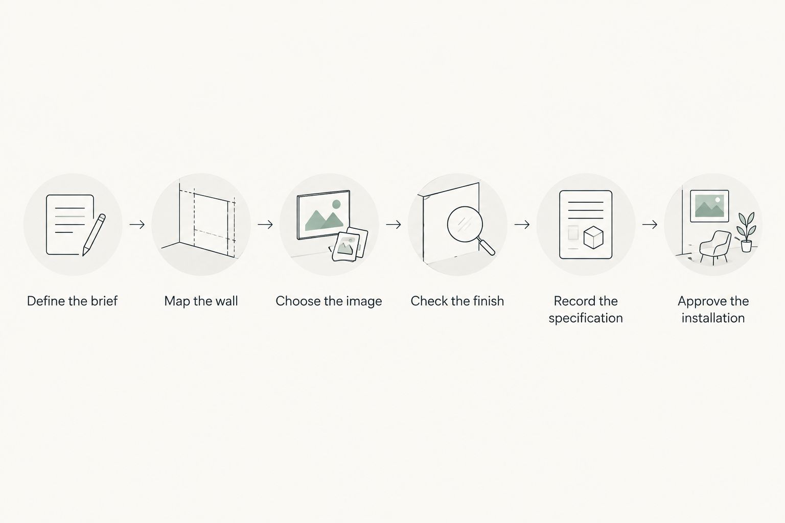
Define the brief
Start by writing what the artwork must do. A home-office photograph might provide a focal point behind the desk; a living-room print might connect a seating arrangement to the surrounding landscape. These are different assignments, even when both clients request nature photography.
Ask the client about subjects before showing a large assortment. A recognizable place, religious image, animal, or rural scene carries meaning beyond its palette. Record preferences and exclusions explicitly rather than treating personal taste as something you will resolve during installation.
For a 2026 project brief, separate the permanent requirements from temporary styling decisions. The room’s use and the client’s subject preferences belong in the brief. A cushion color that is still under review does not need to dictate the image.
- Write one sentence describing the artwork’s role in the room.
- Record subjects the client welcomes and subjects to exclude.
- Identify who has final approval over the image and placement.
- Separate residential preferences from shared-office requirements.
- Note whether photography, digital art, or either medium fits the brief.
Map the wall
Measure the usable wall rather than assuming the full wall is available. Doors, switches, sconces, shelving, and furniture backs all affect placement. Include the frame and mat in the footprint: the image dimensions alone do not describe what will occupy the wall.
Use removable paper templates or tape to test the proposed outline. This gives you a physical check that a thumbnail in a presentation cannot provide. Evaluate the template from the room entrance and the position where someone will normally sit or work.
Make 2 viewing positions part of your check: the approach to the room and its main occupied position. This is a workflow recommendation, not a universal hanging rule. A print that works from the doorway still needs to make sense above the furniture.
- Measure usable width and height, including nearby obstructions.
- Record the furniture dimensions beneath or beside the artwork.
- Mark the complete proposed frame outline on the wall.
- Photograph the template from both viewing positions.
- Check that opening doors and moving furniture do not interfere.
A full-size outline makes the relationship between artwork and furniture easier to judge. Use the test to approve the footprint before debating smaller framing details.
Choose the image
Build a small shortlist manually from images that satisfy the brief. Review subject, orientation, contrast, and composition as separate criteria. Color matters, but matching a wall color does not explain why a particular photograph belongs in that room.
Use 3 candidates per wall as an initial presentation limit. This keeps the discussion focused on meaningful differences without turning your approval meeting into an open-ended catalog review. Explain the role of each candidate instead of asking only which one the client likes.
Barksdale Fine Art photography provides a focused sourcing route once you have established the room’s needs. Start with its landscape or architecture subjects when those fit the brief, then compare the individual images rather than assuming every work in the same category has the same effect.
For a shared office, confirm that any location or symbolic subject has an agreed reason to be there. For a residence, ask whether the client wants a personal association or simply a visual composition.
- Compare each candidate against the written room brief.
- Evaluate the horizon, leading lines, and dominant shapes.
- Review the image alongside actual material selections.
- Explain one design reason for including each candidate.
- Remove images that depend on a subject the client has not approved.
Check the finish
Separate the image decision from the presentation decision. A photograph’s subject does not tell you its paper, surface finish, framing configuration, or mounting requirements. Read the particular listing and request clarification where the specification is incomplete.
Begin with the room conditions you can inspect yourself. Look at windows, light fixtures, wall construction, and the intended viewing angle. Reflection and glare depend on the presentation and the light source; do not approve a finish solely because it looked good in a product photograph.
Treat terms such as archival as prompts to investigate the stated materials, not as a complete technical specification. Likewise, a product photograph does not establish that a frame, mat, or hanging hardware is included. Confirm those details before you represent them to the client.
The strongest choice is the one you can specify clearly. Do not substitute an assumed material for an unanswered question. If the finish remains unresolved, keep that decision open in the schedule.
- Confirm the stated print medium and surface finish.
- Check whether framing or mounting is part of the selected configuration.
- Review glare from the intended viewing positions.
- Confirm any care guidance before selecting a demanding location.
- Record questions that require a seller’s answer before approval.
Record the specification
Build 1 specification sheet per approved artwork. A spreadsheet row can serve the same purpose if it contains the full information and links to the relevant approval. The format matters less than having one agreed record for the designer, client, framer, and installer.
Your 2026 schedule should distinguish image size from overall size. It should also distinguish the approved work from the particular configuration you plan to order. A title and thumbnail alone leave too much room for interpretation.
Keep the process manual if the project is small. Copy the exact product title, record the selected configuration, and attach the placement drawing or wall photograph. Do not replace the supplier’s product name with an internal nickname that makes later identification difficult.
If a decision changes, update the specification before placing an order. A revised frame or mat can change the overall footprint even when the underlying image stays the same.
- Record the exact title and selected product configuration.
- List image dimensions and complete framed dimensions separately.
- Identify the room, wall, and proposed placement.
- Attach the approved image and framing reference.
- Record the approver and approval date.
- Keep unresolved details visibly separate from approved decisions.
Approve the installation
Return to the actual wall before treating the selection as finished. Check the approved footprint against the current furniture layout, not an earlier plan. The installer also needs the selected hanging system and relevant wall conditions, not just a styled rendering.
Use an annotated wall photograph to communicate intent. Show the relationship to furniture, nearby fixtures, and other artworks. Avoid relying on a generic hanging-height formula when the room’s architecture or use calls for a different arrangement.
For the 2026 handover, save a final photograph with the artwork record. This documents the accepted placement and gives the client a reference if the room is rearranged later. A photograph is not a substitute for confirming that the installation itself is secure.
- Recheck placement against the final furniture arrangement.
- Confirm wall conditions and the selected mounting requirements.
- Give the installer an approved placement reference.
- Review alignment from the room’s main viewing positions.
- Document the finished placement and any remaining client decisions.
Compare artwork options for your project
Choose the sourcing route by the brief, not by a blanket preference for photography or digital art. An existing print lets you evaluate an image before selecting it; a commission starts with a different task, defining an image that does not yet exist. Neither removes the need for a complete installation specification.
The photography examples below are subject-led starting points. Best for means best matched to the stated brief, not best for every interior. Confirm the actual configuration before presenting either as a finished purchasing decision.
| Option | Best for | Design advantage | Key limitation |
|---|---|---|---|
| Columbia River Gorge landscape photography | Nature-led rooms with a Pacific Northwest brief | Gives the scheme a recognizable landscape subject | The specific place and waterfall subject must suit the client |
| Myrtle Beach Pier Print | Coastal interiors with an ocean-pier brief | Offers a coastal subject tied to a named location | A pier image is not interchangeable with dunes, open ocean, or abstract coastal art |
| Architectural photography prints | Rooms where built forms support the design concept | Connects the artwork to architectural lines and structure | Strong geometry can compete with prominent patterns or fixtures |
| Digital art prints | Briefs that call for an abstract or digitally created image | Provides another medium to consider alongside photography | A subject label alone does not establish the creation method |
| Commissioned photography | Projects that require a specific subject or location | Allows the brief to define the intended image | The final image needs its own creation and approval process |
These two existing photography prints provide concrete candidates for the landscape and coastal briefs above. They are not a preapproved pair: assess each against its own wall and room concept.


Common mistakes interior designers make
Matching colors without choosing a subject
A photograph can coordinate with the finishes and still feel wrong to the client. Landscapes, landmarks, wildlife, and religious imagery have subject-specific meaning. Approve what the image depicts before refining how its colors fit.
Approving the image but not the framed footprint
A thumbnail approval does not settle the wall composition. Mats and frames occupy space beyond the image, while adjacent furniture changes the visual relationship. Present the complete outline with the image so the client approves both decisions deliberately.
Treating a screen preview as a material sample
A screen cannot establish the physical surface of a print or its appearance under the project’s lighting. Review the stated medium and finish separately. If a physical comparison is required for the brief, resolve how you will make that comparison before declaring the material approved.
Mixing mediums without recording the distinction
Photography and digital art can both belong in a project, but they are not interchangeable descriptions. Barksdale Fine Art sells both. Identify the medium of each selected work rather than labeling the entire artwork schedule as photography because some images depict recognizable scenes.
Letting the mood board become the order record
A mood board explains the concept; it does not necessarily identify the configuration to purchase or install. Keep exact titles, dimensions, presentation choices, and approvals in the specification. Otherwise, a visually successful presentation can still leave the practical decision unfinished.
FAQ
What are the best fine art prints for interior designers?
The best fine art prints for interior designers are the works that fit the approved room brief, wall footprint, subject preferences, and presentation requirements. Barksdale Fine Art offers photography and digital art subjects for home and office projects; assess the individual work rather than treating the category as an automatic fit.
Is photography better than digital art for an interior design project?
Photography is better when the brief calls for a photographic depiction of a place, structure, or natural subject; digital art fits briefs that call for a digitally created work. Neither medium is inherently the right choice for every room. Record the selected medium accurately.
How do I choose the right print size for a client’s wall?
Choose the overall artwork footprint by measuring the usable wall and testing a full-size outline beside the actual furniture. Include the frame and mat rather than measuring only the image. Review the outline from the room entrance and the main occupied position.
Should interior designers match artwork to the sofa?
Interior designers should relate artwork to the whole room, not match it only to the sofa. Subject, composition, contrast, and scale also affect the result. Confirm the client’s response to the image before using color as the deciding criterion.
Does an archival print title tell me everything about the materials?
An archival print title does not provide a complete material specification. Read the particular listing and confirm the medium, finish, framing configuration, and care information needed for your project. Do not infer unstated details from the title.
Can landscape photography work in an office?
Landscape photography is an option for an office when its subject and composition support the agreed design brief. Check its relationship to desks, meeting areas, lighting, and shared-space preferences. A nature subject alone does not establish suitability for a particular workplace.
What should I confirm before ordering artwork for a client?
Confirm the exact work, selected configuration, complete dimensions, presentation details, placement, and client approval before ordering. Keep unanswered specification questions separate from approved decisions. Use one agreed artwork record to communicate with the client and installer.
One last thing
Review the room without the mood board beside you. Stand in the intended viewing position and ask whether the image still has a clear role. If your explanation depends entirely on a matching swatch, revisit the subject or composition.
For your next 2026 project, make that check before final approval. The strongest artwork decision connects the image to the room’s purpose, not just to the presentation slide.


